Couple seasons in, are you used to the new branding? | Page 3 | The Boneyard

Couple seasons in, are you used to the new branding?

Status
Not open for further replies.

SubbaBub

Your stupidity is ruining my country.
Joined
Aug 26, 2011
Messages
32,156
Reaction Score
24,784
As bland as the C was, it was far more distinctive than the current logo or a paw print or just about anything else.

The reason is there aren't any teams using anything similar. SCAR comes closest, but that's hardly the Michigan winged helmet.

It was also classic in it's design, boring to some, but if you are looking to appear traditional then that's a good way to go. It also matches the current word marks. I assume everyone has noticed that the C in UConn is the very same character.

Style choices. The biggest knock I have with the logo and the helmets is that they were Nike clip art and lack any connection to the tradition at UCONN. The timing almost seems to discard the programs rise to prominence.

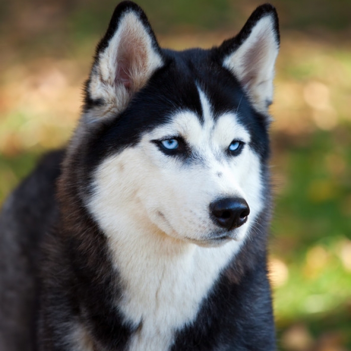
Yes, I think it should have remained a white dog.
 
Joined
Aug 26, 2011
Messages
19,228
Reaction Score
14,061
The block C still lives on in the font of "UCONN".
 

CL82

NCAA Men’s Basketball National Champions - Again!
Joined
Aug 24, 2011
Messages
57,044
Reaction Score
209,316
I mean, it's hard to argue that the new logo doesn't look more like a Husky than the old one...

siberian-husky_medium.jpg


My love for the old one is based mostly on nostalgia rather than aesthetics.
5362042564_5ee2ca6822.jpg


Nope, it just looks more like a particular type of husky.

The new Jonathan costume absolutely sucks.
 

Bonehead

'Ollie North of the Cesspool'
Joined
Sep 1, 2013
Messages
9,360
Reaction Score
8,261
You know Alabamas logo is a cartoon elephant right?
so we are now not talking helmets??

I never say a cartoon Elephant on Alabamas helmets...their logo is an elephant yet, however I think the A is more the logo - but lets agree to disagree - I like the block C and you do not.

Go Huskies.
 

CL82

NCAA Men’s Basketball National Champions - Again!
Joined
Aug 24, 2011
Messages
57,044
Reaction Score
209,316
Blaming a logo (husky) for domestic violence or any violence relating to sports is as ignorant as one could be. Cheeky whoever the hell he is as stupid about this as he is on his BB posts.
To be fair, he isn't the originator of this concept.

Linky
 
Joined
Sep 16, 2011
Messages
48,781
Reaction Score
167,421
I like the old logo because it represented UConn and I love everything UConn but the new logo is way better. Everyone I've talked to who is not a UConn fan prefers our new logo and thinks the old one was kind of lame.
 
Joined
Aug 26, 2011
Messages
5,187
Reaction Score
10,674
I don't love the new logo, but I didn't love the old logo, either. It's fine.

I'm about 10,000 times more concerned about conference alignment and the future of our athletic department. The logo is the least of our problems.
 
Joined
Aug 26, 2011
Messages
6,438
Reaction Score
18,126
logo didnt need to be re-branded, why ruin a good thing? Why waste time and money on re-branding when we should have been using the resources to get the hell out of AAC.
 
Joined
Sep 21, 2011
Messages
5,516
Reaction Score
13,319
I don 't pay much attention to logo's
But the football helmet screams "Loser"
They should be burnt.
 
Joined
Aug 26, 2011
Messages
217
Reaction Score
260
My only issue with the new logo is that we didn't keep a letter logo as well (we seem to use UCONN written out fully). Most schools have a letter logo and a 'cartoon' logo to go along. We should have kept either the Block C or the interlocking UC that basketball used along with the new Husky logo.
 

Stainmaster

Occasionally Constructive
Joined
Aug 7, 2014
Messages
22,004
Reaction Score
41,501
I don 't pay much attention to logo's
But the football helmet screams "Loser"
They should be burnt.

The play on the field doesn't help with that.
 
Joined
Aug 26, 2011
Messages
6,374
Reaction Score
16,572
I could care less.

But, I would definitely change the helmet. Why? Because we aren't winning games. Got to change that up.
 
Joined
Jul 31, 2013
Messages
2,616
Reaction Score
6,391
I am fine with the logo, the mascot costume is totally awful, and I like the court. The court is simple but clean and pops to me. I like the 2-tone wood with the inside of the paint area in a different wood shade. Was watching a game recently with a non-fan who remarked that she really liked the court design, and I like that. Court shouldn't be over-done or busy like the oregon one

no opinion on football... just regret that we have a team since if we didn't maybe we'd be in the fake Big East right now...
 
Joined
Sep 21, 2011
Messages
5,516
Reaction Score
13,319
The play on the field doesn't help with that.
Maybe our helmet choice and our play are not mutually exclusive occurrences!
It's difficult to play your best when you are embarrassed. //
Okay
There may be no causal relationship , but our record with those helmets is a fact.
Destroying any symbol of the last few years is a step in the right direction.
 
Joined
Jan 20, 2012
Messages
744
Reaction Score
2,484
The day that the new logo came out, I tweeted "I'll get used to this once we win a national championship under it."

Well, that didn't take long.
 
Status
Not open for further replies.

Online statistics

Members online
613
Guests online
5,955
Total visitors
6,568

Forum statistics

Threads
157,111
Messages
4,083,594
Members
9,980
Latest member
Texasfan01


Top Bottom