
- Joined
- Oct 13, 2012
- Messages
- 2,429
- Reaction Score
- 9,387
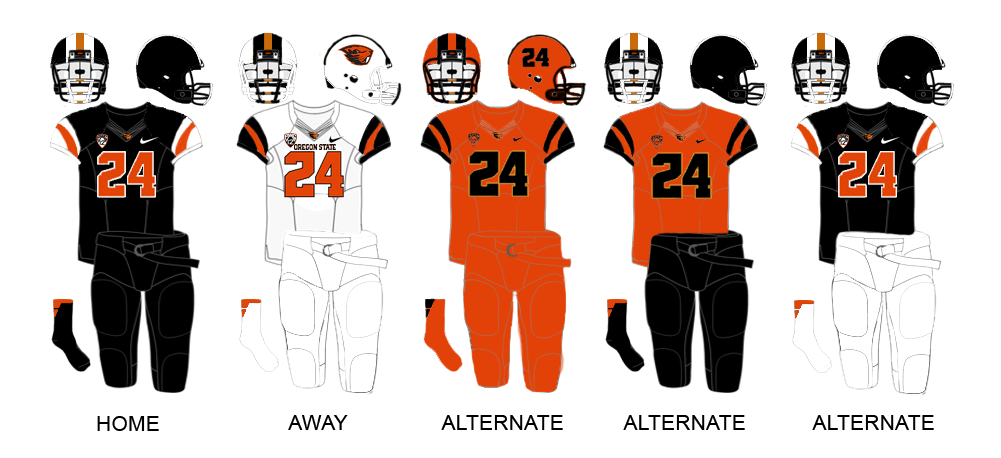
A couple years in now, other than our joke of a football helmet (seriously, it's time to cut the crap and give us back the block 'C'), I generally think Nike did a good job with the brand overhaul. I didn't think we actually needed an overhaul, but if we had to have one, it definitely could've gone worse (see State, Oregon).
Personally, though, I still miss the old (2002-2013) logo. Aesthetically, there's nothing wrong with the new one, so it might just be that in my mind I associate the old logo with the Big East days and the new logo with the American. Not a favorable comparison.
I'm not a fan of the new court design. The new logo at center court actually looks great, maybe even better than the old one did, but everything else is too busy.

Typically the programs with tradition (be it in college or the NBA), have a simple, clean court design. Gimmicks like different shading inside the 3 point line and sticking a logo everywhere there's room just feels cheap. The clipart-esque American logos don't help. I think getting rid of the "UConn Huskies" type that wraps around the upper corners would probably be good.
On the other hand, I think the football field design is awesome.
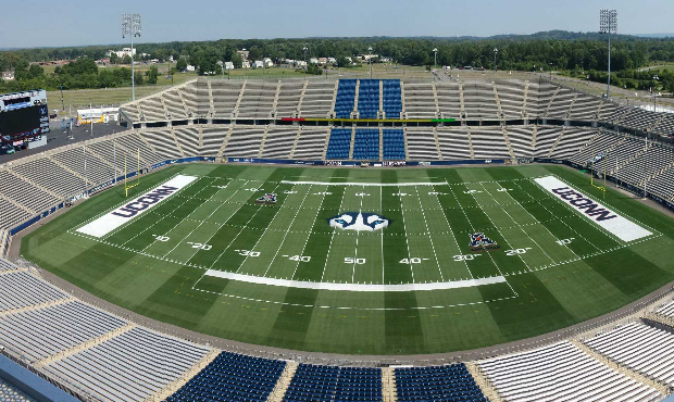
Nice and simple. Unique center field logo that might actually be intimidating if the team were any good. I like that they kept the block font for the yardage numbers and end zone text. Only thing I'd change would be making the end zone color blue instead of white, or maybe just getting rid of the fill color altogether and just having the UCONN text.
Aaaanyway. I know we kind of discussed this subject to death back when the new logo and designs were first introduced, but over time I've gotten used to them and (in most cases) I like them more now than I originally did.
Personally, though, I still miss the old (2002-2013) logo. Aesthetically, there's nothing wrong with the new one, so it might just be that in my mind I associate the old logo with the Big East days and the new logo with the American. Not a favorable comparison.
I'm not a fan of the new court design. The new logo at center court actually looks great, maybe even better than the old one did, but everything else is too busy.
Typically the programs with tradition (be it in college or the NBA), have a simple, clean court design. Gimmicks like different shading inside the 3 point line and sticking a logo everywhere there's room just feels cheap. The clipart-esque American logos don't help. I think getting rid of the "UConn Huskies" type that wraps around the upper corners would probably be good.
On the other hand, I think the football field design is awesome.
Nice and simple. Unique center field logo that might actually be intimidating if the team were any good. I like that they kept the block font for the yardage numbers and end zone text. Only thing I'd change would be making the end zone color blue instead of white, or maybe just getting rid of the fill color altogether and just having the UCONN text.
Aaaanyway. I know we kind of discussed this subject to death back when the new logo and designs were first introduced, but over time I've gotten used to them and (in most cases) I like them more now than I originally did.


")