- Joined
- Dec 11, 2013
- Messages
- 1,992
- Reaction Score
- 7,833
I love that

I love that
Agreed. That's actually very cool.I love that
If you were going to do call of the wild, this is the way to do it.
Wouldn’t mind it on a blue helmet with the white on the logo in chromeLooked nice, but needs less red and more blue.
The last few years, we have been playing like the Washington GeneralsNah, prefer blue. The white on white on white has a very Washington Generals feel to it.
") . Hope next year we can play like a top 90 team...
. Hope next year we can play like a top 90 team...That would be a HELL of a helmet in a bowl game...
Perhaps on a blue helmet.The last few years, we have been playing like the Washington Generals
The white helmets just look way better.. plain and simple.. not even close...I think this current combo is fine - no need to change just because the coach will change. We had our highest points of success with the Block C and the Husky dog is a simple alternate. Both do the job. They will look a lot better to people once we start winning again.
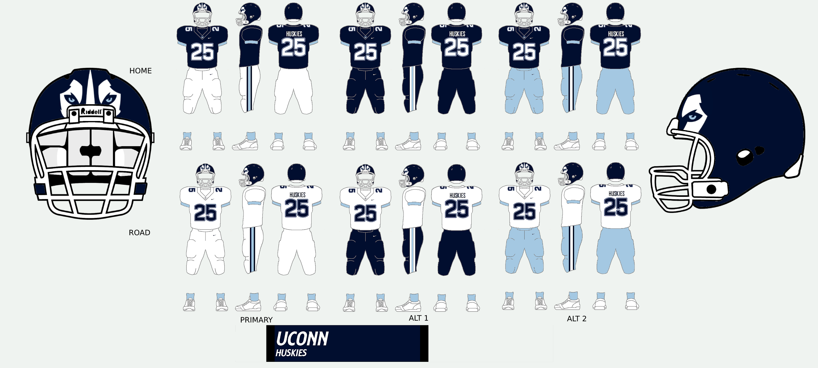
View attachment 71087
Not for nuthin but why is this pic taken in front of a UConn Basketball sign. I mean. Cmon man!View attachment 71070
Noticed in the pic above we have the white husky dog helmet in the background versus the block C
Two things....I remember the lecterns in the larger halls had this helmet logo etched into the front of them in the late 90s. Also, I know it's mostly a relic from a bygone era, but the NCAA Football PlayStation II game from 2002 or 2003 issued helmet stickers. Caulley's helmet was half white by the time I played NC State in a bowl game from the number of dog bones on the back.

First, check out this link.
UConn helmet history
Second, the dirty little secret of the “block C” is that it is the last remaining remnant of the Aeropostal uniforms
So when people pain away for the “traditional” of the block C, there really pining away for the days when Aeropostal made our uniforms.
The single worst design in the history of helmet design. And yes, I have seen Maryland’s.
First, check out this link.
UConn helmet history
Second, the dirty little secret of the “block C” is that it is the last remaining remnant of the Aeropostal uniforms
So when people pain away for the “traditional” of the block C, there really pining away for the days when Aeropostal made our uniforms.
Yep, but it lacks the outlining and spacing that football uses.Actually, the Block C is on every current UConn uniform. The UCONN wordmark uses the exact same font. The "C" in UCONN is the very same block C. One you see it you can't unsee it.
Yeah it’s so nice let’s save it for a special game. Maybe the conference championshipThe chrome is nice as a special alternative. I would like the idea of using it once a year for a significant game but believe it wouldn't work if we used it too often.
My view of the blue helmets with the block C is the one redeeming quality is they are a reminder of when we were at our best. My preference here would be a once every few years throwback.
What I would like the best (again, only one person's opinion) would be for our primary helmet to be a white with the block C, but the block C a bit smaller (80%-85% the current size) and a single blue stripe. Maybe one or two games a year use the husky logo instead of the C.
There has always been something about a clean, crisp look, without too much noise that gives the impression of being more together, more developed, more organized and professional than what wild color schemes presents.
Word Homey. He who transfereth, sustains.State Motto literally means hit the transfer portal hard and good things will happen… I like it.
Late to the game moeThe single worst design in the history of helmet design. And yes, I have seen Maryland’s.